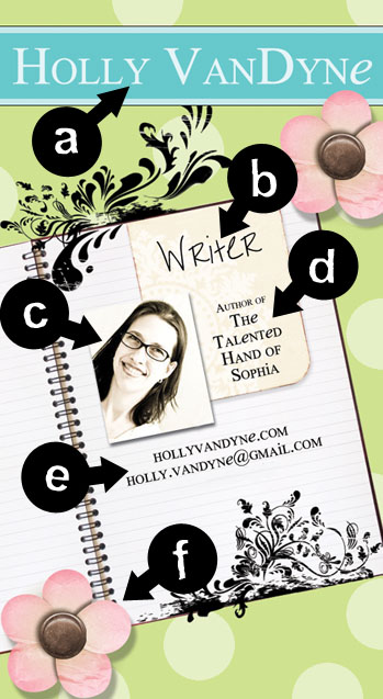
Anatomy of a Writers Business Card
Next weekend I’m excited to be attending the Central Ohio Scarlet & Gray SCBWI Writer’s Conference! I can’t wait to soak up the information and hopefully stay far away from embarrassing situations this time (previous post).
The last time I went to a conference I made some print-your-own business cards the morning I left. When I ripped them apart, the sides left perforations and ultimately I was too embarrassed to give more than one out. So this time, I was more prepared and designed some professional looking ones to print cheaply through Vistaprint. But I hit a bump – what information do I need on them? A Google search for “writer’s business cards” didn’t wield me many results or helpful examples. So I pretty much winged it and thought I’d share the results.
A – Name
Don’t forget it. And don’t forget to make it stand out – CAP it,bold it, throw a different color on it, stick it at the top. Your name is one of the most important things you have going for you. Use it and make it look GOOD!
B – Title
So what are you? Writer seems pretty general, I’m sure you could probably think of something more creative than I did. But I’m a simple girl (hubster’s nickname for me is “mashed potatoes without gravy). Whatever it is you do – be sure to put it on there and let the world know.
C – Picture
I was on the fence about this one. I HATE pictures of myself and normally don’t use one if I don’t have to, but the point of the card is to help people remember/recognize me. Like it or not, my mug is one of the best ways to do that. It’s so much easier to put a face with a name, isn’t it?
D – Book Name
I hesitated on this one. If your book is already published or at least agented I would say “Go for it!” because its a smaller chance of you wasting your cards. But I’m still working on those two things for SOPHIA. So say I order 100 cards, give out twenty then decide to trunk the novel down the road. I’ll have to throw the other 80 cards out, won’t I? But I want people I meet to remember the book, so I made the (possibly silly) decision to put it on there. If SOPHIA doesn’t end up getting published then I’ll just use the backs for doodling in my art classes.
E – Contact Information
No questions on this one – you NEED this. The person holding the card needs to know how to get in touch with you, that’s the whole point of the card, right? I figured I didn’t need my snail-mail address but did include my website and email addresses. I also put my phone number (that I erased for this posting).
F – Extra Goodness
Make it look like you! Or in my case, I made it look like my website. Same colors, design elements, fonts, etc. If someone has been to my website before, chances are they might look at this and think “I’ve seen this before.” Branding is huge and having coordinating marketing efforts help establish your “brand”. Even if you can’t do the same design, using the same colors would help.
And last of all – you want to make your business card (and you!) stand out. Just something as simple as flipping the card 90 degrees will do that for you. Now don’t get me wrong – don’t go printing your card on toilet paper or something crazy like that. Like your query letter, synopsis, ms, etc. it still needs to look professional and presentable. Sometimes it just needs a little something extra to make them remember your card (and you!).